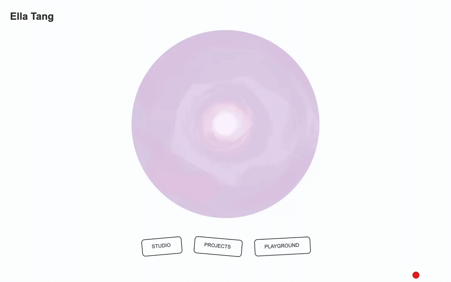
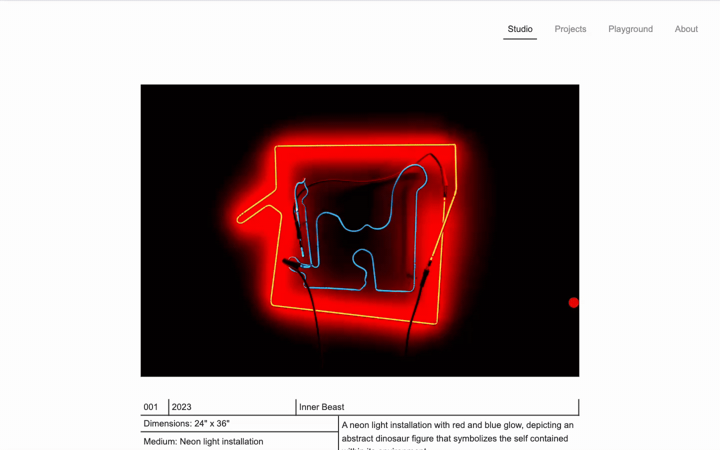
This site was designed as a digital home for work across studio art and interactive media through three main sections: Studio, Projects, Playground.
It was built from scratch using HTML, CSS, and Javascript.


No items found.

This site was designed as a digital home for work across studio art and interactive media through three main sections: Studio, Projects, Playground.
It was built from scratch using HTML, CSS, and Javascript.
A Personal Portfolio Website


In the year 2046, a time with more advanced technologies, a capitalist-controlled Metaverse becomes the primary workplace. What is hidden inside the sugar-coated metaverse workplace is the labor exploitation that no one can escape from. People have to work day and night like hamsters on a perpetual wheel to sustain themselves.
As work takes over life, social relationships of people are built more based on virtual identities, and their real-world identities gradually diminish. As a result, death is no longer the end of biological life, but rather the moment when a person's real-world identity is entirely replaced by their virtual identities.
Through scanning the digital screen that randomly displays a portrait of the deceased from by 100 AI-generated human faces with their mobile device, viewers will be able to enter a memorial hall in augmented reality. This AR experience was built in Unity.

This 1 min 44 sec short video expands in a non-linear narrative.


Role
Researcher
Designer
Tools
Figma
Too Much Information, Too Much Fatigue
Today, people are saving more information than ever. Devices offer way more storage than before, and cloud services make it easy to save everything. But the more saved, the more need to manage. Despite having tons of productivity tools around us, from calendars to to-do lists to voice memos, many people still report feeling overwhelmed. This is because many of those tools still require decision-making on things like labeling, structuring, and prioritizing, which actually drains energy and leads to cognitive fatigue.
The landscape analysis focused on widely used tools, such as Apple Notes, Google Calendar, and third-party apps, such as Todoist, Sunsama, and Structured. While each app offers useful features, they also present limitations that Cactus aims to improve on.
Simple and built-in — but lacks structure
Works basically as a digital version of a traditional paper notebook. Easy for information to become scattered and difficult to retrieve.
Great for scheduling, not for general info
Requires manual adaptation for unstructured tasks
Smart capture, priority levels — but has overwhelming UI
The mobile app feels overly simplified, while the desktop version can feel overly complex. The calendar view, though informative, can lead to visual overload due to the high density of interface elements.
Ritual-based and timeline-based interfaces — but require too much manual input
And too many unnecessary decisions, such as selecting color for each task. While color selection offers personalization, it often feels more aesthetic than practical, providing limited functional benefit and leading to more visual clutter.
To better understand user needs, informal user interviews were conducted with family members and friends.
Too much manual input
Current tools interfaces are too complex
Hard to find things, don’t remember label
Input preferences: voice, text, or visual
Most open to AI but want control and clarity
Based on the findings from competitor analysis and user studies, four primary user personas were developed to reflect these identified pain points people experience with current tools

Needs help remembering life’s little moments

Wants structure, but no time for it

Always on the move — needs fast, hands-free support.

Struggles to know where to start
Conversational AI & Voice interaction
The app allows storing and retrieving anytime anywhere through conversations
Auto categorization & prioritization
The app automatically categorizes, prioritizes, and organizes tasks behind the scenes, reducing theneed for manual input.
Minimal visual design & interfaces
The visual design is intentionally calm and minimal, avoiding overwhelm and keeping the interface quiet and focused.
Down to Earth Simplicity: Designing for Calm and and Clarity
Cactus is designed to feel calm, grounded, and approachable. Instead of loud colors or complex shapes, it uses soft tones, clean lines, and open space so that every element has room to breathe.


The color palette is soft and neutral, inspired by cactus in natural environments. Functional colors are used just to highlight the tasks based on its level.

iOS Native Apple system font / San Francisco

The Cactus logo was designed to reflect both the personality and the function of the app.


All the icons are 24px height and width and 2px stroke weight with theme variants in "Light” and “Dark” and state variants in “Selected” and “Default.”


Role
Designer
Developer
Tools
Figma
HTML
CSS
Javascript
Where Play Meets Story
"Cute, fast, and surprisingly fun..."
"A collectible storybook you play over and over."
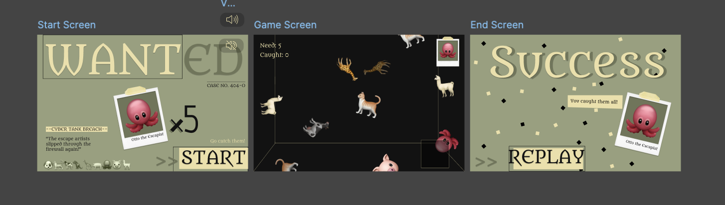
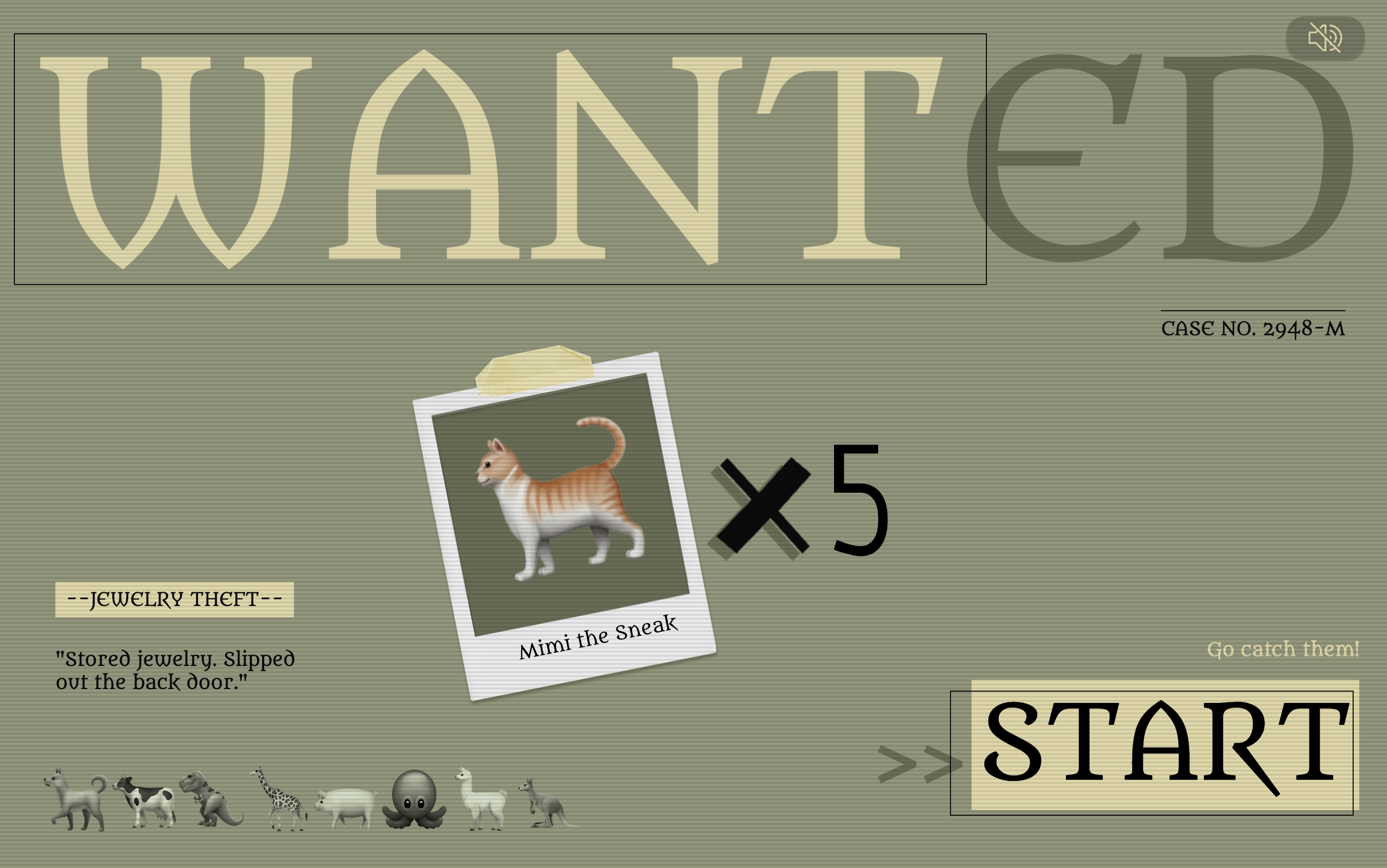
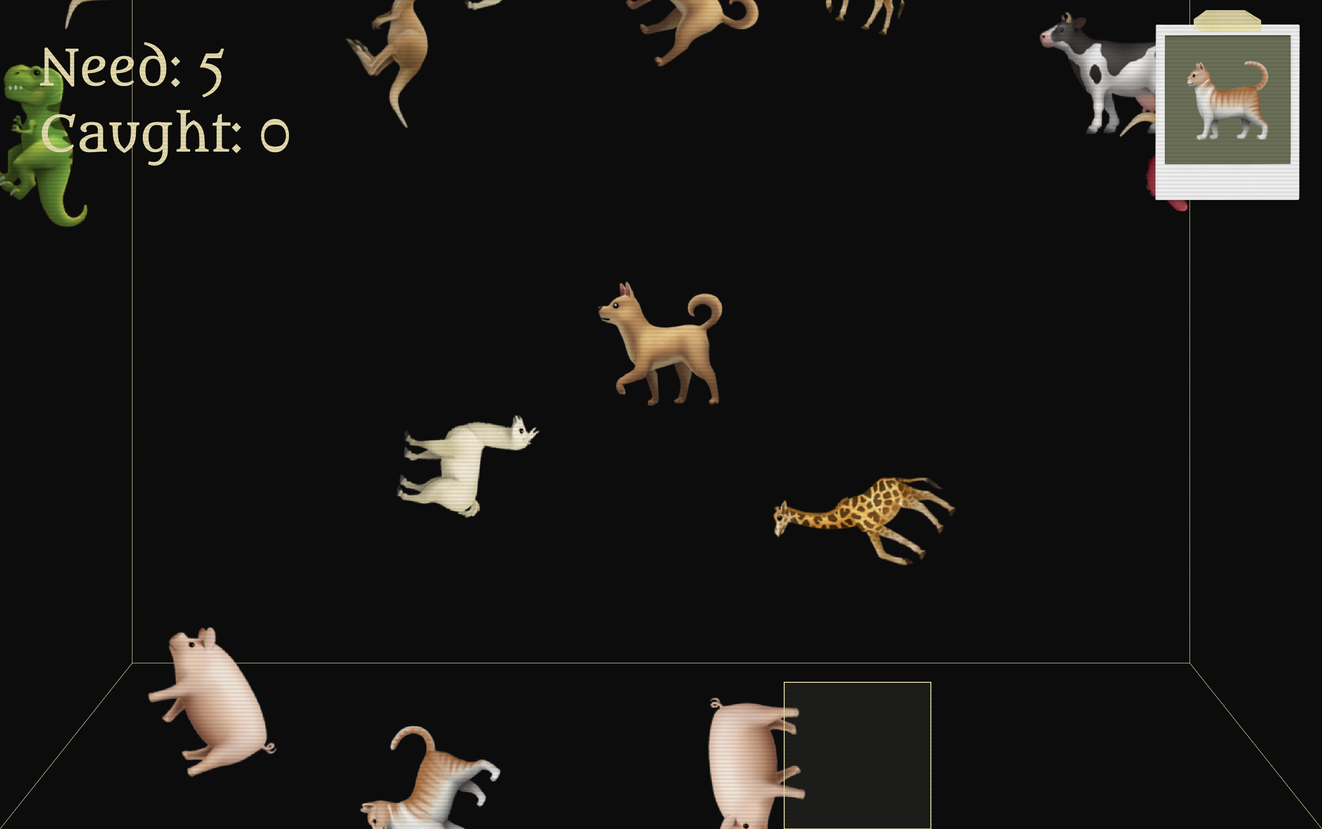
Mischievous animal fugitives have broken free! Armed with a catch box, it’s up to you to round them up before they escape. Each round is unpredictable, with randomly selected characters and distinct outcomes. Catch ‘em if you can in this retro fugitive-chasing experience!
Poster designed for each animal fugitive
Each animal fugitive in Wanted has a custom-designed poster as its character bio, including the fugitive’s name, crime, case number, and backstory, in the form of a wanted notice.


Designed in Figma
The interfaces for Wanted’s core screens (Start, Game, and End) were initially designed in Figma. This stage focused on defining the overall visual language, experimenting with colors and typography while keeping consistency between the game’s narrative theme and its UI elements.

Role
Designer
Developer
Tools
HTML
CSS
Javascript
Coming from a diverse art background, my work has spanned across painting, sculpture, installation, coding experiments, and interactive media. As I transitioned into art and technology, I needed a portfolio that could reflect both my past in the arts and my current work in interactive media.

Existing platforms and templates felt limiting as they often emphasized either static visuals or text-heavy case study. As a result, they tend to fall short when it comes to showcasing multidisciplinary work.
For someone working across different media and both traditional and interactive, the challenge was to create a digital space that allows for experimentation, showcasing the playfulness while stays simple so users aren’t overwhelmed.

Organize content so diverse projects (art, media, code) can coexist.
Support both static documentation (paintings, installations) and interactive experiments.
Create an interactive “Playground” space where visitors can try live coding sketches.
Prioritize whitespace, typography, and clean navigation over decoration.
The final design splits works into three sections: studio for traditional works, such as paintings and drawings; projects for flagship projects; and playground for playful, light works.
for traditional works
.gif)
for flagship projects

.gif)
for playful works
.gif)
.gif)