Cactus

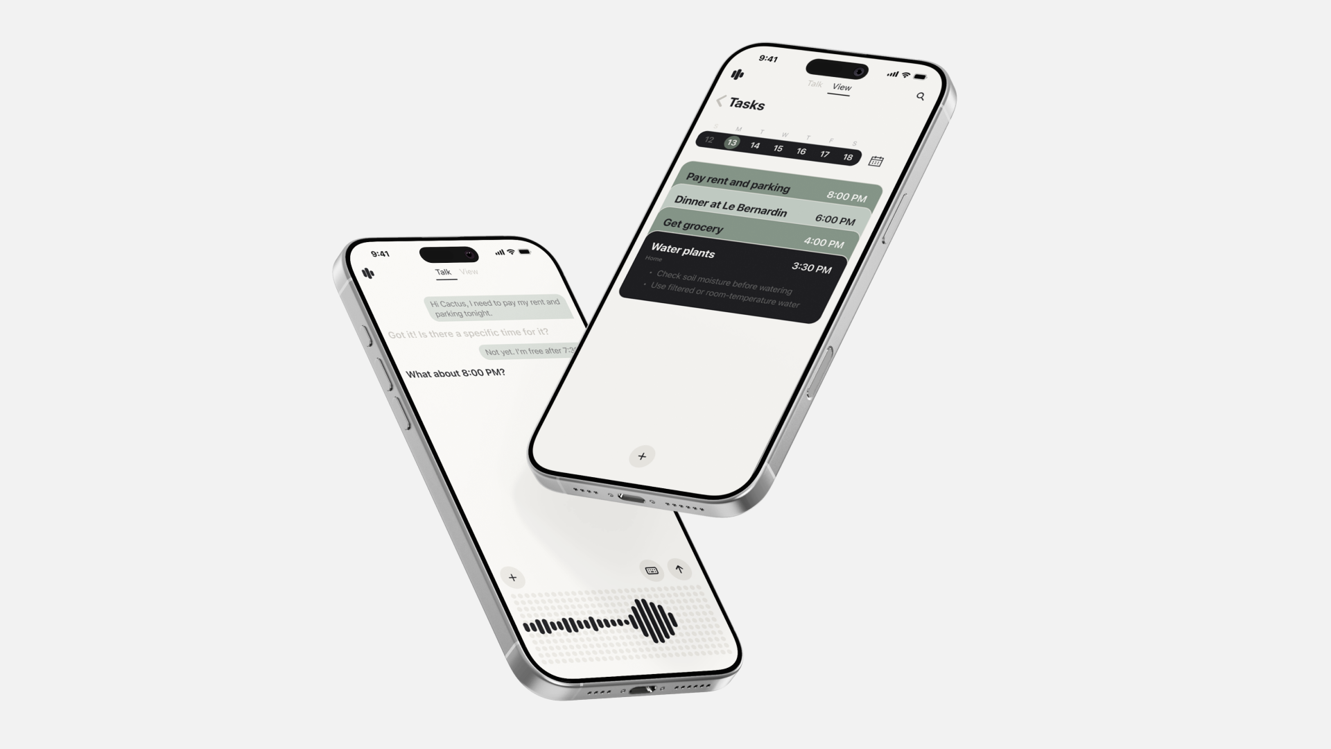
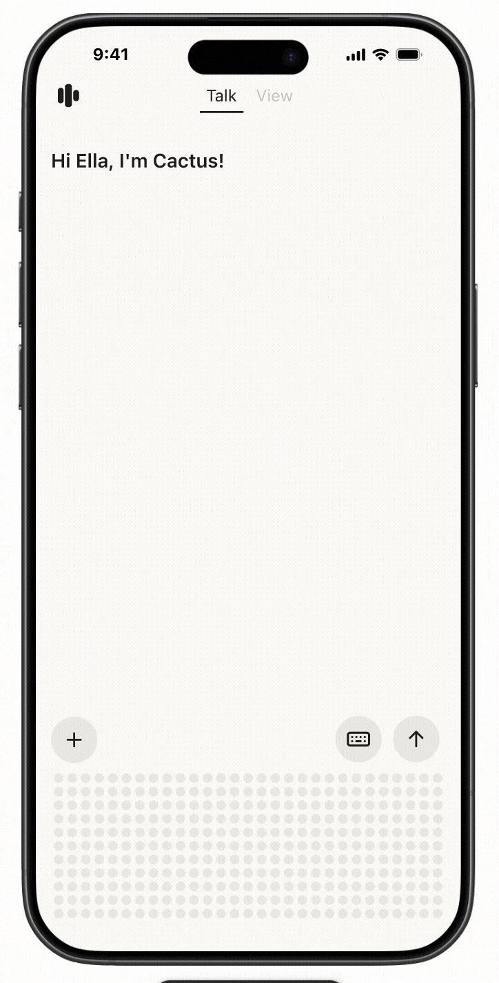
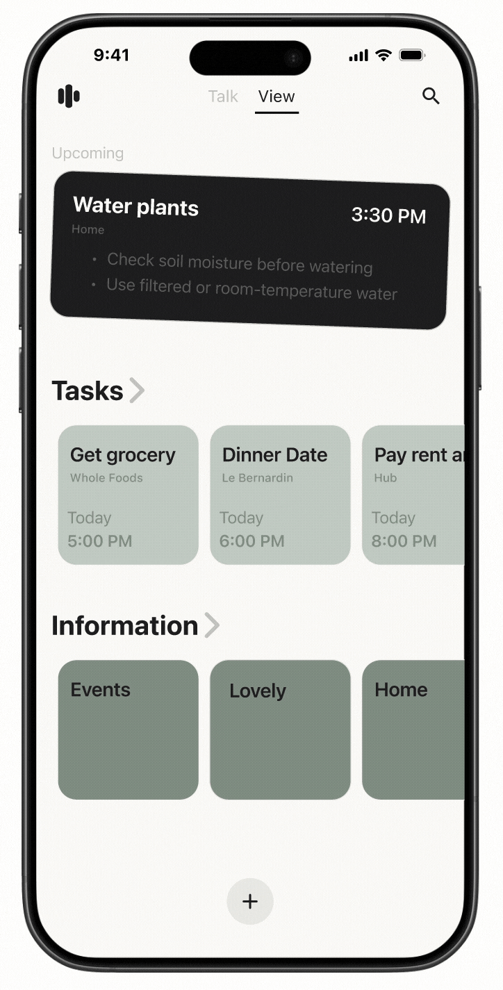
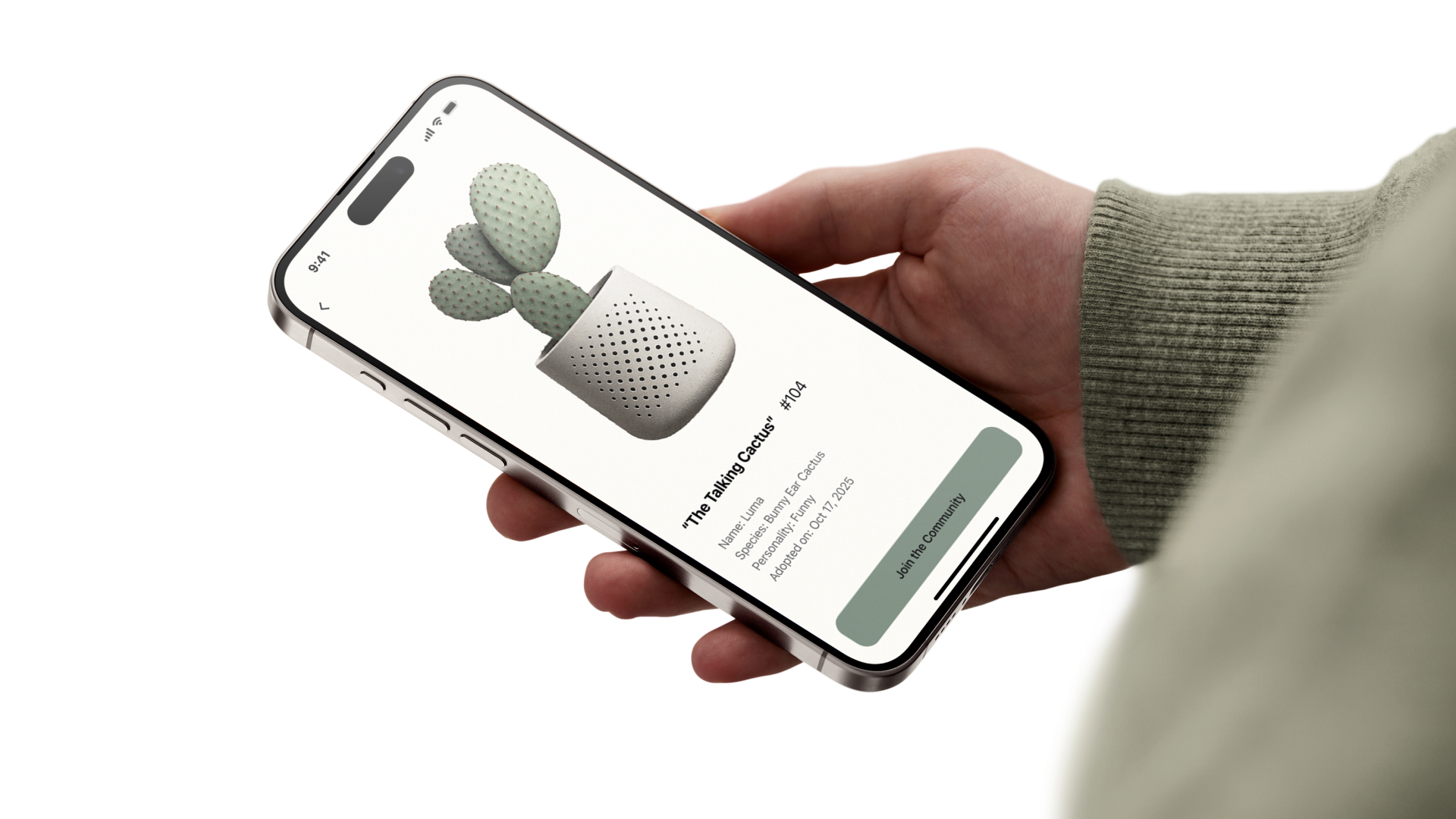
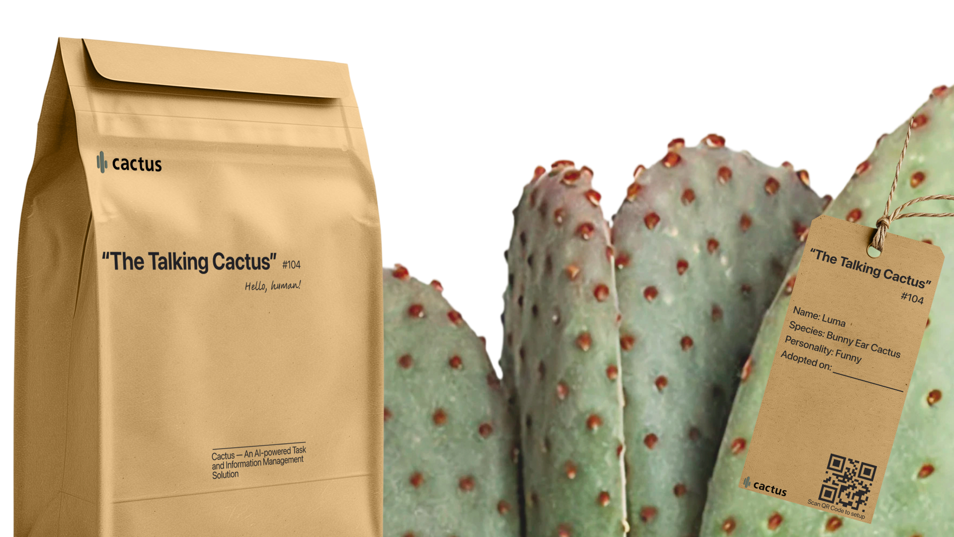
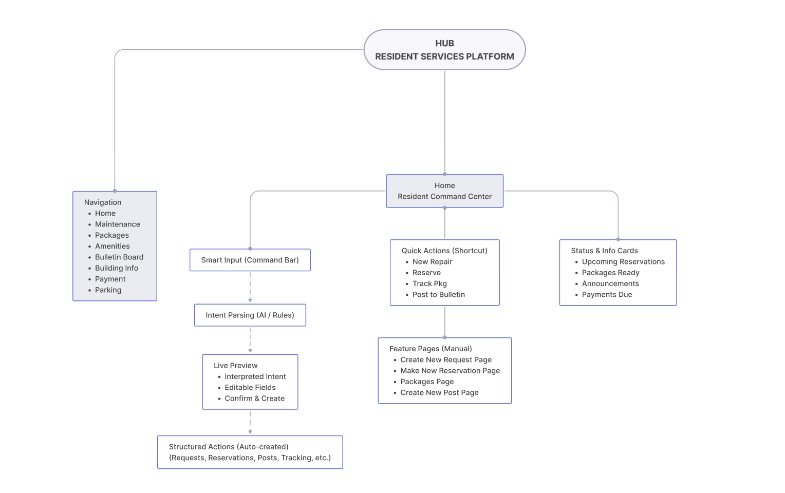
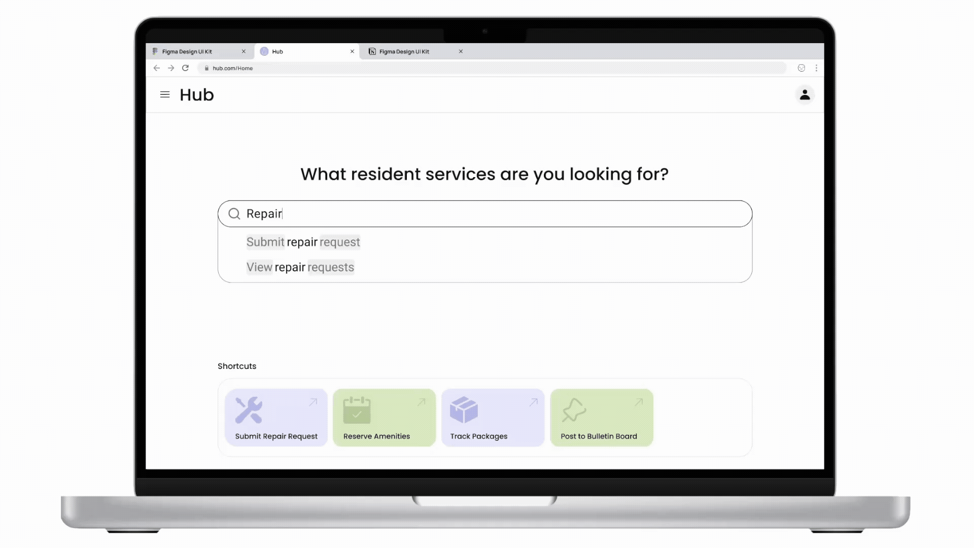
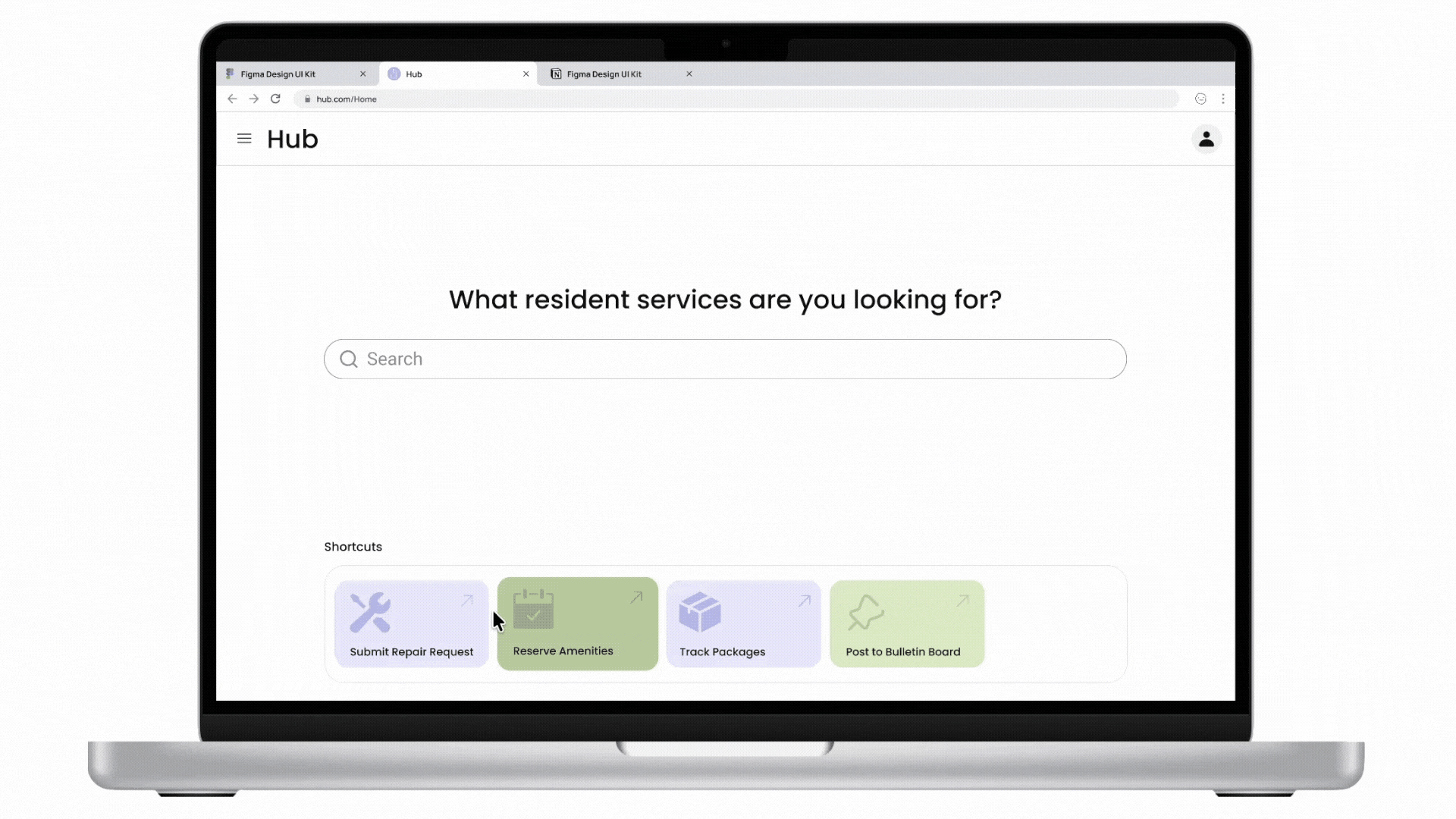
Cactus is a task and information management app designed to reduce cognitive overload through conversational AI and smart automation. The project is inspired by cognitive science studies and built upon extensive user experience research. I led user research, product definition, and interaction design, translating cognitive load theory into practical UX decisions across onboarding, task capture, prioritization, and AI-driven recommendations.

Try Skylow

Context

Learning Should Be Active, Not Passive

Traditional video is built around watching, not thinking. Most learning videos follow a fixed, one-way flow where everyone gets the same experience, no matter what they already know or what they’re curious about.

But learning doesn’t work that way. Real learning happens when people ask questions, pause to reflect, and explore ideas as they come up. With traditional video, the moment a question arises, learners have to stop, rewind, or search elsewhere. This breaks focus and momentum.

Skylow starts from a different belief: learning should be active, responsive, and personal.

Solution

A New Model for How People Learn

Skylow turns learning into a live meeting. Instead of watching a creator speak to everyone the same way, learners interact with an AI version of the creator in a one-on-one session. You can ask questions as they come up, go deeper into topics you care about, and explore ideas at your own pace. The AI can respond in real time, and bring up dynamic UI, such as diagrams, code, or examples, to help explain ideas as you go. This shifts online learning from passive watching to active participation, making it feel more like talking to a real tutor than sitting through a lecture or replaying a recording.

01

Interactive

Ask questions, debate ideas, write code, or sketch concepts, all in the same session.

02

Personalized

Adjust tone, depth, and style so the experience fits how you learn best.

03

Memorized

The more you interact, the better Skylow understands you, and the better the experience becomes.

Early Design

When Familiar Patterns Worked Against the Goal

Rejected direction: A traditional video player with an adjacent chat panel.

Early on, we tried a familiar approach: a traditional video player with a chat panel on the side. It matched what people were already used to and felt like a safe starting point. But as we tested it, a problem became clear. The layout still put video first and conversation second. Even with chat available, the experience encouraged watching over interacting. People treated the session like a normal video, and the conversation felt optional rather than central. This worked against Skylow’s core goal. Learning was still passive.

To better support active learning, we moved away from playback-centered patterns and redesigned the experience around conversation.

A New Interaction Model — Designed Against “Watching”

Instead of designing Skylow like a video player, we designed it like a live session. Every part of the interface is meant to gently push users away from passive watching and toward active participation. Rather than pressing play and sitting back, users are invited to join a conversation. The experience is framed as something you’re part of, not something you consume.

Adopted Interface: Entry with code editor as default content 

Adopted Interface: Fullscreen Interface with AI Avatar focused

Adopted Design Decisions

01

“Join” instead of “Play”

Users join a session rather than start a video. This small change sets the expectation early: this is interactive, and you’re meant to participate.

02

No video progress bar

There’s no timeline to scrub through. Removing the progress bar reinforces that this isn’t content to skim or replay. It’s something happening in real time.

03

Live conversational feedback

Visual cues like audio waves show that the system is listening and responding. This helps the experience feel alive and conversational, not one-sided.

04

Call-inspired controls

Playback controls are replaced with call-like actions, such as hang up instead of pause. This keeps the mental model closer to a conversation than a video.

Iteration | 1

From Conversational Video to an AI Learning Tool Built Around Meetings

Skylow started as a conversational video platform, exploring how people could learn by talking with content instead of just watching it. This approach worked well. Users asked thoughtful questions, stayed engaged, and used Skylow to make sense of complex ideas.

As Skylow was increasingly adopted for coursework and academic learning, we observed that users approached sessions with clear expectations: they wanted guided progression, stable context, and the ability to reference material while engaging in discussion. Unlike open-ended conversations, coursework requires structure to support cumulative understanding.

We learned that while conversation makes learning feel more natural, it isn’t enough on its own. Effective learning also needs structure. Students need to see the content clearly, follow along with code or materials, and ask questions without losing their place. This led Skylow to evolve from a conversational video platform into a learning tool built around live, structured meetings.

01

Learning-First Navigation

We introduced a progress bar organized by concepts. This lets users jump between topics, review what they need, and skip ahead without encouraging passive, video-style watching.

02

Multi-Modal Participation

To support different ways of learning, Skylow includes a real-time transcript and text input alongside voice. Users can follow along live, look back at past explanations, or participate through text when speaking isn’t ideal.

03

Session Controls & Accessibility

We added simple controls like pause and language switching so users can learn at their own pace and in ways that work best for them, improving accessibility beyond voice alone.

04

Join a Meeting, Not a Call

Sessions are designed to feel like joining a meeting, not starting a call. Seeing the on-screen avatar creates a sense of shared space and makes participation feel more present and intentional.

Video demonstrate how to start a Sklyow AI meeting and some interactions.

Iteration | 2

Previous Skylow Homepage

Designing for Early-Stage Growth

Early on, Skylow’s homepage focused on browsing existing content. That worked when there was a lot to explore, but in an early-stage product, limited content made the experience feel empty and harder to get started.

We also learned that people came to Skylow to create for very different reasons. Some wanted to quickly think through an idea by dropping in a question, link, or file. Others wanted to carefully create structured, reusable sessions. Treating creation as a single, fixed flow didn’t support these different needs.

To grow the ecosystem, creation needed to be easier, faster, and more flexible, especially for first-time users.

01

Two Creation Paths

We introduced two clear ways to create. A quick-create path lets anyone start a session in one step by entering text or uploading a link, file, or video. A more advanced path gives creators extra control to build structured sessions and personalized avatars.

02

Creation-First Homepage

The homepage was redesigned to put creation front and center. By focusing on a single input and removing distractions, the experience encourages users to start by expressing an idea, lowering friction for first-time use.

03

Shuffle Create Ideas

To reduce the “blank page” problem, we added a shuffle feature that shows example prompts in the creation area. This helps users understand what’s possible and makes it easier to start without overthinking.

04

Auto-Scroll to Content

As users scroll, existing content is gradually revealed. This keeps creation as the main entry point, while still allowing people to discover sessions naturally without competing with the act of starting something new.

Video demonstrates current Skylow homepage flow for new users

Current Skylow homepage featured section

Current Skylow playlist detail page

Visual Philosophy

Human at the Core

Skylow is about making AI learning feel human. Therefore, Skylow's visual design brings together a natural, human feel and a clean academic aesthetic. Through minimal design and selective usage of sharp edges and thin strokes, the interface feels neat and quietly elegant. Skylow also supports both light and dark mode, so the experience feels comfortable across different environments and longer study sessions.

Skylow homepage light and dark mode

Learning with AI shouldn’t feel like entering a tool. It should feel like entering a space.

Inspired by the line “行到水穷处,坐看云起时”, this sign-in page is designed as a quiet moment before learning begins. The interface is clear and unhurried, while the landscape opens outward, creating space to pause and breathe. It frames learning not as something to rush into, but as a journey you enter calmly, at your own pace.

Skylow sign-in page light and dark mode

Nature-Inspired Neutrals

Skylow’s palette comes from granite and fog: soft paper backgrounds, cool greys for depth, and graphite for crisp focus.

Context

Too Much Information, Too Much Fatigue

Today, people are saving more information than ever. Devices offer way more storage than before, and cloud services make it easy to save everything. But the more saved, the more need to manage. Despite having tons of productivity tools around us, from calendars to to-do lists to voice memos, many people still report feeling overwhelmed. This is because many of those tools still require decision-making on things like labeling, structuring, and prioritizing, which actually drains energy and leads to cognitive fatigue.

Solution

Human Talk, System Work

Cactus is built on the idea that people shouldn’t have to organize their thoughts while they’re still forming them. Instead of asking users to decide structure upfront, Cactus allows for natural expression first through speech or text while the system takes responsibility for understanding, organizing, and presenting information. This approach doesn’t reduce functionality; it redefines the division of labor between humans and AI, lowering cognitive load at the moment of input and surfacing clarity later, when users are ready to reflect and act.

Conversational AI & Voice interaction

Allows storing and retrieving anytime anywhere through conversations

Auto categorization & prioritization

Reduces the need for manual input and labeling or prioritizing tasks

Minimal visual design & interfaces

Prevents overwhelm and makes the experience quiet and focused

Video introducing Cactus

Core Design

arrow pointing east

Talk

Upon entering the app, users arrive at the Talk screen, the central space for interaction, where they can create new tasks or information simply by talking to Cactus. This solves a key problem: even when users don't want to think, they can still offload thoughts. For first-time users, a brief onboarding moment introduces how Cactus works and sets the tone for a low-friction, voice-first experience.

arrow pointing east

View

By swiping to the right, users can toggle to the View screen. Unlike the conversational nature of the Talk screen, View supports a more intentional mode of thinking. Here, users can visualize what they’ve captured: tasks are laid out in a clean, card-based interface, making it easier to scan, prioritize, and re-organize. This mode is especially useful when users want a sense of control, clarity, or overview.

Future Cactus

When AI Becomes a Long-Term Thing

Rather than proposing a set of future features, the future of Cactus explores a more organic, long-term relationship between humans and AI. As AI becomes part of everyday life, what does it feel like when its looks like a tool but something we live alongside like a real plant? Through Cactus, users can upload and clone their own voice, allowing voice to become part of a global exchange. A stranger might receive a Talking Cactus that speaks in someone else’s voice. This raises questions about how voice-based AI systems might create unexpected connections in an increasingly digital world, where human relationships often feel more distant.

The Talking Cactus is a living form that extends beyond the app. It is a real cactus that speaks, listens, and grows with user. Unlike devices such as Alexa or HomePod, each Talking Cactus is unique and truly alive that needs care and attention. The type of cactus user receive is a surprise, revealed only when it arrives. Every Talking Cactus comes with a custom ID card and care instructions.

Design System

Prototype

Context

Task-first mindset: Residents want to get things done quickly

Resident service platforms are supposed to make everyday life easier, but many end up doing the opposite. Actions people do the most, such as reporting an issue, reserving an amenity, checking a package are buried in menus and categories. Users spend more time figuring out the system than getting things done.

From research and real use, one thing became clear: people open the app because they want to do something right now. They aren’t thinking in system labels. Instead, they’re thinking, “my sink is leaking” or “did my package arrive?” When the interface doesn’t match this way of thinking, simple tasks start to feel slow and frustrating.

Solution

Action-First Approach

Hub keeps things simple. Instead of making people dig through menus or figure out where something belongs, it lets them start by saying what they need directly on the homepage. You can type something like my sink is leaking” or tap a quick action and move on. Once you do that, Hub takes care of the rest in the background, such as figuring out what the task is, what information is needed, and what should happen next. The user doesn’t have to think about categories, forms, or steps that don’t matter. The result is an experience that feels quick and straightforward. You open the app, do the thing you came for, and get back to your day.

Lower Friction

Users don’t have to stop and decide where their request fits before they can act.

Matches How People Think

Residents think in real situations, not system labels or app sections.

Works Even When Used Occasionally

The product stays easy to use even if someone only opens it once in a while or is in a hurry.

Design Objectives

001 Simplify Workflow

Make common tasks easy to reach and quick to finish. Most actions should take one or two steps, with flexible paths that work for different habits and situations.

002 Reduce Confusion

Use clear layout, familiar icons, and simple language so users always know where they are and what to do next without having to stop and think.

003 Build a Consistent Visual System

Create a visual system that feels calm and predictable across the product, using shared patterns, balanced spacing, and a consistent rhythm.

Core Design

Access Through Search or Browse (Earlier Version)

An earlier version of Hub focused on helping users find the right place faster through search and browsing. This made navigation clearer, but users still had to understand how the system was organized and move through multiple steps to finish a task. In other words, it improved wayfinding, but users still had to translate their needs into system terms and follow traditional flows.

Moving From Navigation to Smart Action (Iteration)

As I tested Hub, it became clear that making navigation easier wasn’t enough. The real challenge wasn’t helping people find features; it was helping them actually get things done.

Therefore, Hub shifted its focus to helping them complete actions directly. Instead of asking users where they want to go, the homepage now lets them simply say what they need. A smart command bar allows users to type requests such as “my sink is leaking” or “check my package” without worrying about how the system is structured.

As users type, Hub understands their request in real time and shows a preview of what will happen next, such as a maintenance request draft or a package lookup. This makes it easy to confirm or tweak details before submitting. From the user’s perspective, everything stays simple and lightweight. There’s no digging through menus or following long steps, just quick input, clear feedback, and fast completion.

001 Realtime Feedback

Users can immediately see how the system understands their request, which builds confidence and reduces mistakes.

002 Quick Completion

Most tasks can be started and finished right from the homepage, with fewer steps and less waiting.

003 Flexible Refinement

If something needs adjusting, users can make small changes on the spot without breaking their flow.

Video demonstrates how to reserve an amenity from smart command on homepage.

Preserving Familiar Flows

Not everyone wants to change how they do things. Therefore, even with the new command bar, Hub doesn’t take anything away. The shortcuts and navigation people are already used to are still there. If someone prefers clicking through the homepage or using the sidebar, they can keep doing that. If they want something faster, they can try the command bar. Both ways work, so people can move at their own pace, use what feels comfortable, and still get things done.

Video demonstrates familiar flows to reserve an amenity.

Design System

Color System Rationale

Hub uses green and purple to keep the experience clear and calm. Green highlights moments of progress and completion, giving users quick reassurance that things worked. Purple acts as the main structural and brand color, helping organize the interface without adding urgency. Together, they make Hub feel reliable, approachable, and easy to use.

Try Wanted

Concept

Exploring Motion as a Narrative Device

In Wanted, emojis are dropped into a world with gravity. They fall, bump into each other, get stuck, or slip away. A collision can feel funny, frustrating, or surprising, even though it’s all driven by physics.

Each animal emoji comes with its own small backstory. That context changes how you read what happens. The same fall can feel tragic for one character and ridiculous for another. A narrow escape can feel like a win, or like something barely held together.

Nothing is acted out on purpose. The emojis don’t perform, they simply move. But because you know who they are and what’s at stake, their motion starts to feel meaningful.

In Wanted, story emerges from motion, chance, and the context you carry into each round.

Design System

Color and Typo Rationale

Wanted leans into a vintage, slightly worn aesthetic. Muted, earthy colors and classic typography are chosen to give the game a nostalgic feel, almost like something pulled from an old book or poster. That makes the emojis feel less like stickers and more like little characters with weight.

Try it

Overview

How it works

Bloom lets users create using either hand gestures or a mouse. By hovering over a flower for 1.5 seconds, users select it, allowing the next generated flower to inherit visual “genetics” from the previous one. Users can also generate a random flower at any time, introducing mutation. Through this balance of inheritance and randomness, forms evolve continuously through interaction. The video below is a live screen recording that shows this process.

Concept

Can Code Create Something Organic?

The project began with this question.

Core Design

A Canvas where Computations Give Rise to Organic Creation

Bloom examines how algorithms can move toward behaviors that feel grown rather than designed. It treats code as a living system that is capable of mutation, inheritance, and emergence, so that the digital, too, can act as nature does: imperfect, adaptive, and alive. Every aspect of the experience is intentionally designed, from interaction to subject, to reflect this logic.

arrow pointing east

Interaction

Before language, humans used gestures to express themselves. Bloom builds on this instinct by choosing hand gestures—one of the most natural forms of human interaction—as an invitation for users to create.

arrow pointing east

Shapes

Each flower comes from a genetic algorithm that encodes color, shape, and structure capable of inheritance, variation, and mutation.

arrow pointing east

Textures

The visual combines a textured, paper-like digital canvas with glass interface elements to create analog warmth on a digital screen and a sense of depth.

arrow pointing east

Snapshot

A built-in snapshot feature captures the canvas, mimicking the feel of preserving moments using an analog instant camera.

arrow pointing east

Palette

Inspired by Monet, the palette comes from muted florals and water-toned blues and greens.
The colors are meant to feel organic and slightly imperfect, embracing natural variation and flow to create a calm, living atmosphere.

Design System

View Arrival

Concept

Reimagines a Familiar Childhood Object

Arrival is a story about memory, told through a duck-shaped robot I built. It started from something I loved as a child: those colorful coin-operated rides outside grocery stores. You’d drop in a coin, climb on, and for a minute or two, the world felt paused. Mine was a duck. It played music, rocked back and forth, and somehow felt alive.

I rebuilt that duck, but stripped it down. No music. No buttons. No interaction. Just movement. Slow, hesitant, and quiet, like a memory that drifts back at night without explaining itself. The duck isn’t really alive, but it doesn’t feel like just a machine either. It sits somewhere in between.

That in-between space, between real and remembered, is what this project explores. Arrival doesn’t try to tell a full story. Instead, it holds onto a feeling: the moment when something you loved as a child returns, slightly changed. Familiar, a little strange, and quietly emotional.

Production

The Duck Enclosure

The duck bot started as a memory but I wanted to give it shape. I sketched from what I remembered: the oversized eyes, the rounded bill, the clunky but comforting proportions of the supermarket ride. From there, I modeled the body in Fusion 360. The final shell was 3D printed in multiple parts using PLA filament, then hand-sanded, glued, and assembled with internal mounting points for the electronics.

After assembly, I spray painted the surface and finished it with a glossy clear coat to bring back the plasticky shine I remembered from childhood. That overly bright, almost toy-like finish. To push it further, I added hand-drawn outlines around the edges using black marker to give the duck a cartoonish feeling, so the whole object feel less like a product and more like a character, and it is flat and dimensional at the same time.

Inside the Duck

Inside the duck bot is a system of motors, power, and microcontroller. The bot is powered by a rechargeable 18650 lithium battery, connected to a small dual-motor driver and an Arduino-compatible Feather board. Two geared DC motors drive the rear axle, giving the duck slow, slightly uneven motion to make it feel less mechanical and more alive. The front wheel spins freely, letting it drift or turn subtly depending on the surface. Movement is controlled via Bluetooth using a serial connection from my phone, allowing me to cue short directional commands during filming.

The Final Duck Bot

Filming the Arrival

The video wasn’t just documentation; it was the story itself. I wanted it to feel quiet, slow, and slightly surreal. Like watching something familiar enter an unfamiliar world. Therefore, I designed the duck bot to arrive not through a door or from a corner, but from a microwave, where a Peking duck was heated and transformed into a duck bot. The absurdity of that transformation is part of the story. It plays with the line between what was real and what’s been reimagined.

I filmed the initial sequence at night within an apartment setting. There’s no dialogue. Just the space. Just the human. Just the duck. Later, I filmed the remaining scenes in Central Park, the place where Holden Caulfield once wondered where the ducks go in winter. It was a cloudy afternoon in January New Yrok City. I drove the duck bot wandering through the park, past bridges, and toward a yellow rubber duck I placed as a stand-in for something remembered.

Overview

How it works

Users begin by entering a wish as a simple line of text. Once the wish is written and submitted, they blow out the candle as a deliberate gesture to mark its completion and release. The screen then responds to this action. The video below shows how the interaction works.

Concept

Make a Wish, Everyday!

Wishes explores how everyday rituals can be reimagined through physical-digital interaction. From the simple act of making a wish and blowing out a candle, the piece invites participants to pause, reflect, and engage with a moment of quiet intention. Rather than saving wishes for birthdays or special occasions, Wishes suggests that hope and desire deserve space in our daily lives. By separating the act into two parts: a physical candle embedded with sensors and a digital screen that responds, the installation turns a private thought into a subtle exchange between human and machine. At its core, the project asks: What happens when technology supports not productivity, but presence?
How might we design for emotion, ritual, and small moments of magic?

Production

The Physical Candle

Wishes is made of two parts: a candle embedded with sensors and powered by an Arduino Uno, and a digital screen that responds alongside. Inside the candle’s enclosure, a sensor detects when a participant blows toward the flame, simulating the experience of extinguishing a real candle. A capacitive touch sensor adds an optional layer of interaction, allowing the candle to be toggled on and off. The flame itself is represented by a softly glowing LED that fades out once breath is detected, triggering a gentle message of luck on the connected screen.

The Digital Screen

On the digital side, the experience is built as a web interface using HTML, CSS, JavaScript, and the p5.js library. Participants enter their wish into a text field, which sends a signal to the physical candle and places the system in a waiting state. The candle is equipped with a sensor that detects when it is blown out; once triggered, a microcontroller sends a signal back to the web interface. This signal initiates a programmed visual and textual response on screen, creating a bidirectional interaction loop that connects digital input with physical action through breath.

Reel

Concept

Designing systems instead of static visuals

In this project, I explored how expressive visuals can emerge from rule-based systems through p5.js. I designed generative experiments across 2D and 3D geometric forms. Simple geometric primitives are combined through rotation, balance, and parameter-driven motion to produce complex, character-like behaviors without relying on predefined animation. By adjusting parameters such as angle, scale, and temporal offset, the system generates varied poses and movement patterns, demonstrating how expressive behavior can emerge from minimal geometric rules.

Prototype

Context

Current WeChat AI Search Doesn’t Really Help You Find People

WeChat search has some AI today, but it mostly acts like a guide. When someone types something like “find all the recruiters in my contacts,” WeChat doesn’t actually show the recruiters. Instead, it explains how to use tags or how to search manually.

But that’s not how people think. Most of the time, we remember others by context, not by name. Examples are who is the recruiter I talked to about SWE roles, who is the person helped me rent an apartment years ago, or who is currently living in New York.

Because WeChat is still built around chat history and keyword matching, searches often return message snippets or group chats where a word appears, rather than the person you’re actually looking for. This forces users to scroll, open the wrong chats, and rely on memory to figure things out. As time passes and relationships change, this only gets harder.

Solution

Make People Search Actually Work Through AI

WeChat already supports people search, but it mainly relies on exact names, manual tags, and keyword matches in chats. This works when contacts are carefully labeled but breaks down when users remember someone by context instead of name. This redesign builds on WeChat’s existing people search, but adds contextual understanding, so search works even when users don’t remember exact names. Behind the scene, AI summarize signals from past chats, moments, and interactions, such as roles, topics, places, and time into lightweight contact context, all processed locally for privacy. When users search things like “recruiters I talked to last year” or “people in New York,” the system can return relevant people directly. Importantly, the interaction stays familiar. Search remains a search bar, not a chatbot. AI suggestions are optional, editable, and shown only when users search, preserving control while making people easier to find.

Why not a chatbot? Why place AI in the search?

Finding people is a navigation task, not a conversation. Keeping AI search in the existing search respects user mental models. A chatbot adds unnecessary back-and-forth for a recall problem.

How to ensure security & privacy using AI?

AI processing happens locally and privately, using on-device context rather than sending raw chat content to external services.This ensures sensitive conversations, contacts, and social relationships remain private.

Why optional smart aliases?

AI assists with suggestions, but users always decide what gets saved.

Core Design

001 AI People Search

Understands intent (role, time, place); Returns people, not messages. Stays inside the existing search flow.

002 AI Summary

AI summarizes key points from chat history, so users can quickly tell who someone is and why they matter.

003 Smart Alias

AI suggests alias based on context extracting from chat history, moments, and channels. Users decide. Everything is editable.

Video is a high-fidelity interactive prototype demonstrating AI search and smart alias flows