Try Skylow

Context
Learning Should Be Active, Not Passive
Traditional video is built around watching, not thinking. Most learning videos follow a fixed, one-way flow where everyone gets the same experience, no matter what they already know or what they’re curious about.
But learning doesn’t work that way. Real learning happens when people ask questions, pause to reflect, and explore ideas as they come up. With traditional video, the moment a question arises, learners have to stop, rewind, or search elsewhere. This breaks focus and momentum.
Skylow starts from a different belief: learning should be active, responsive, and personal.

Solution

A New Model for How People Learn
Skylow turns learning into a live meeting. Instead of watching a creator speak to everyone the same way, learners interact with an AI version of the creator in a one-on-one session. You can ask questions as they come up, go deeper into topics you care about, and explore ideas at your own pace. The AI can respond in real time, and bring up dynamic UI, such as diagrams, code, or examples, to help explain ideas as you go. This shifts online learning from passive watching to active participation, making it feel more like talking to a real tutor than sitting through a lecture or replaying a recording.
01
Interactive
Ask questions, debate ideas, write code, or sketch concepts, all in the same session.
02
Personalized
Adjust tone, depth, and style so the experience fits how you learn best.
03
Memorized
The more you interact, the better Skylow understands you, and the better the experience becomes.

Early Design
When Familiar Patterns Worked Against the Goal
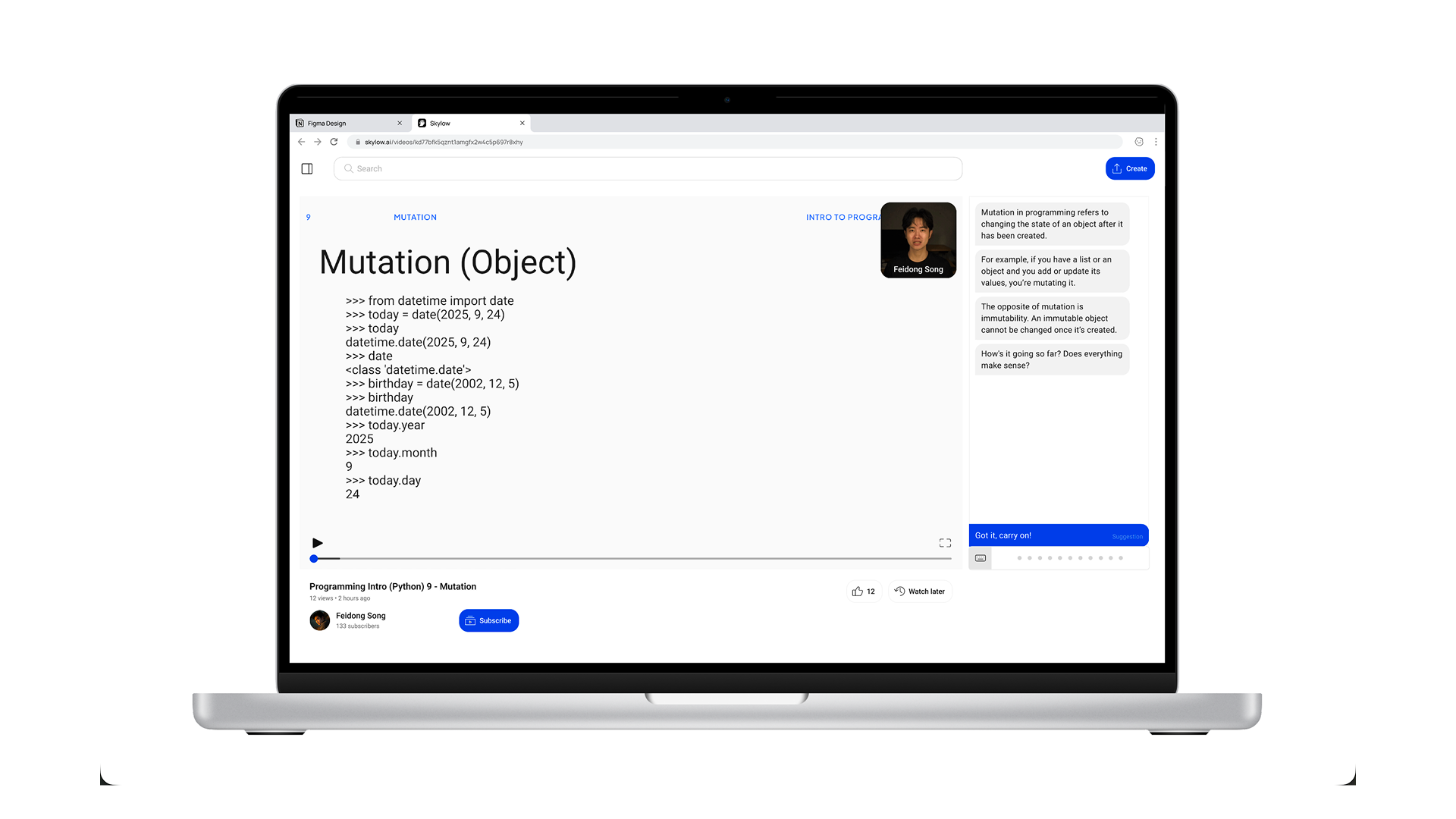
Rejected direction: A traditional video player with an adjacent chat panel.
Early on, we tried a familiar approach: a traditional video player with a chat panel on the side. It matched what people were already used to and felt like a safe starting point. But as we tested it, a problem became clear. The layout still put video first and conversation second. Even with chat available, the experience encouraged watching over interacting. People treated the session like a normal video, and the conversation felt optional rather than central. This worked against Skylow’s core goal. Learning was still passive.
To better support active learning, we moved away from playback-centered patterns and redesigned the experience around conversation.
A New Interaction Model — Designed Against “Watching”
Instead of designing Skylow like a video player, we designed it like a live session. Every part of the interface is meant to gently push users away from passive watching and toward active participation. Rather than pressing play and sitting back, users are invited to join a conversation. The experience is framed as something you’re part of, not something you consume.

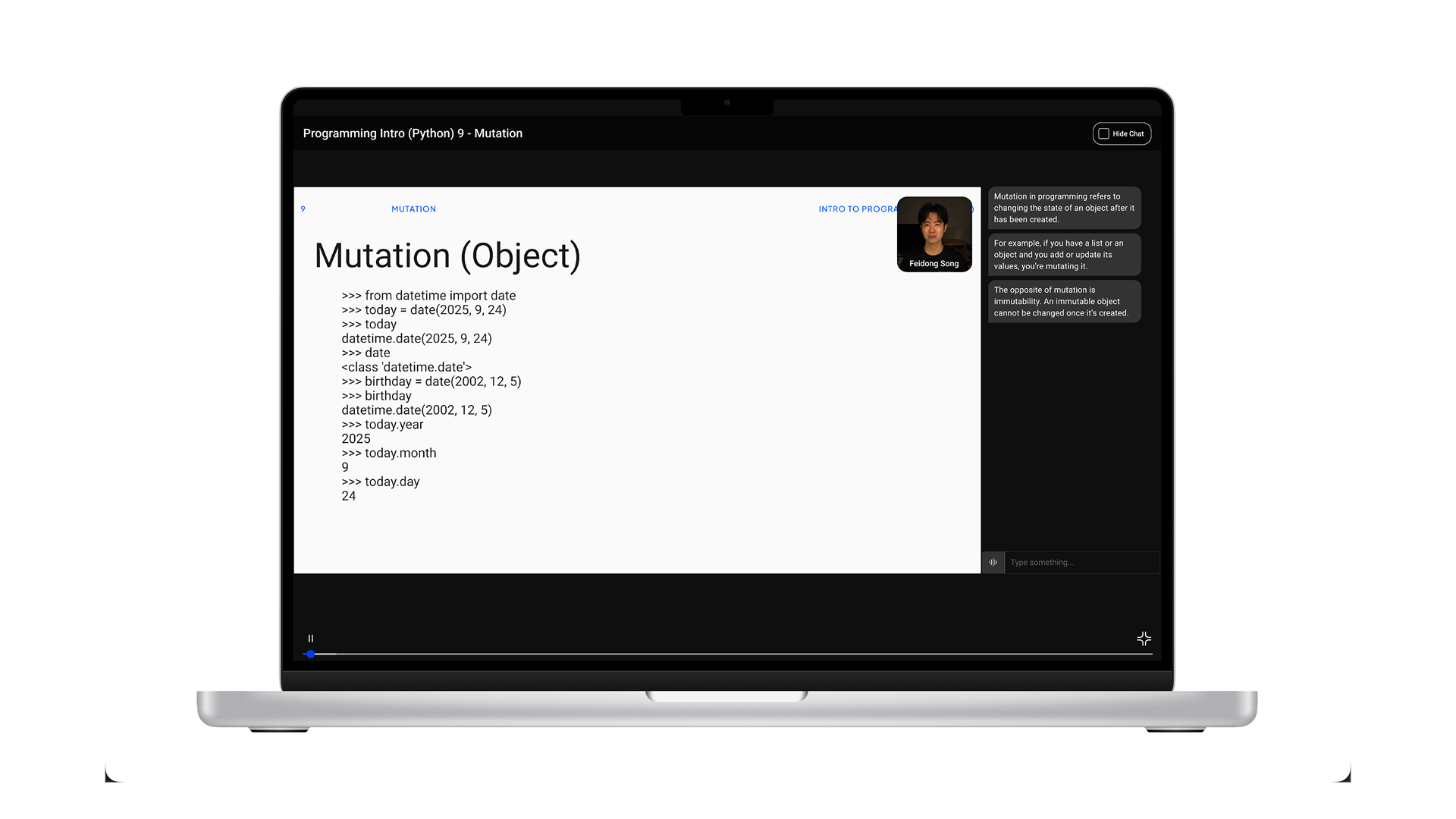
Adopted Interface: Entry with code editor as default content
Adopted Interface: Fullscreen Interface with AI Avatar focused
Adopted Design Decisions
01
“Join” instead of “Play”
Users join a session rather than start a video. This small change sets the expectation early: this is interactive, and you’re meant to participate.
02
No video progress bar
There’s no timeline to scrub through. Removing the progress bar reinforces that this isn’t content to skim or replay. It’s something happening in real time.
03
Live conversational feedback
Visual cues like audio waves show that the system is listening and responding. This helps the experience feel alive and conversational, not one-sided.
04
Call-inspired controls
Playback controls are replaced with call-like actions, such as hang up instead of pause. This keeps the mental model closer to a conversation than a video.
Iteration | 1
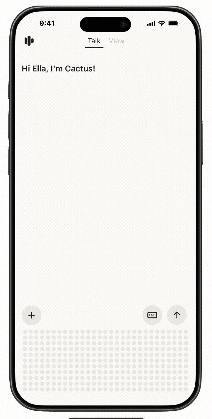
From Conversational Video to an AI Learning Tool Built Around Meetings
Skylow started as a conversational video platform, exploring how people could learn by talking with content instead of just watching it. This approach worked well. Users asked thoughtful questions, stayed engaged, and used Skylow to make sense of complex ideas.
As Skylow was increasingly adopted for coursework and academic learning, we observed that users approached sessions with clear expectations: they wanted guided progression, stable context, and the ability to reference material while engaging in discussion. Unlike open-ended conversations, coursework requires structure to support cumulative understanding.
We learned that while conversation makes learning feel more natural, it isn’t enough on its own. Effective learning also needs structure. Students need to see the content clearly, follow along with code or materials, and ask questions without losing their place. This led Skylow to evolve from a conversational video platform into a learning tool built around live, structured meetings.
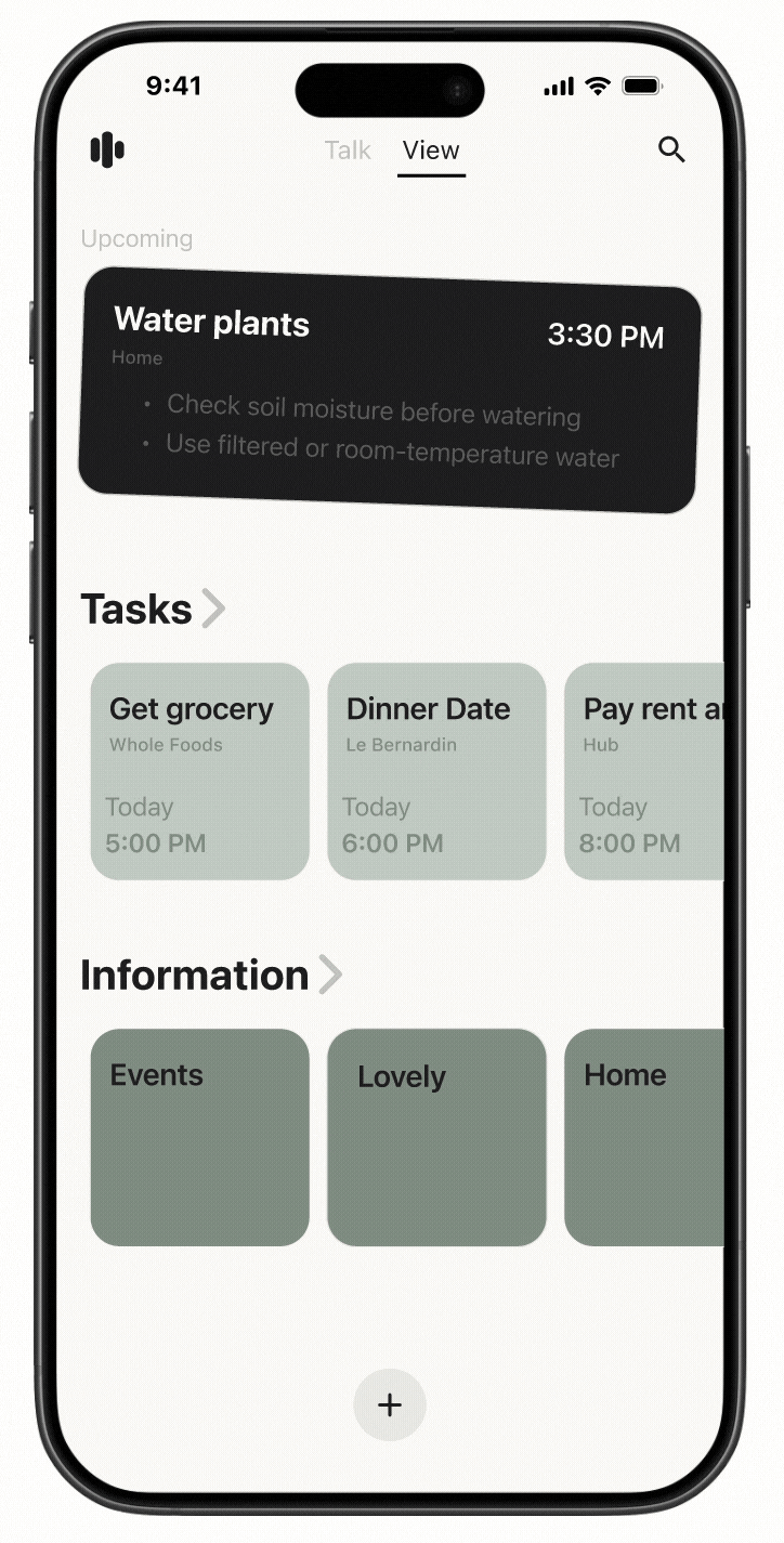
01
Learning-First Navigation
We introduced a progress bar organized by concepts. This lets users jump between topics, review what they need, and skip ahead without encouraging passive, video-style watching.
02
Multi-Modal Participation
To support different ways of learning, Skylow includes a real-time transcript and text input alongside voice. Users can follow along live, look back at past explanations, or participate through text when speaking isn’t ideal.
03
Session Controls & Accessibility
We added simple controls like pause and language switching so users can learn at their own pace and in ways that work best for them, improving accessibility beyond voice alone.
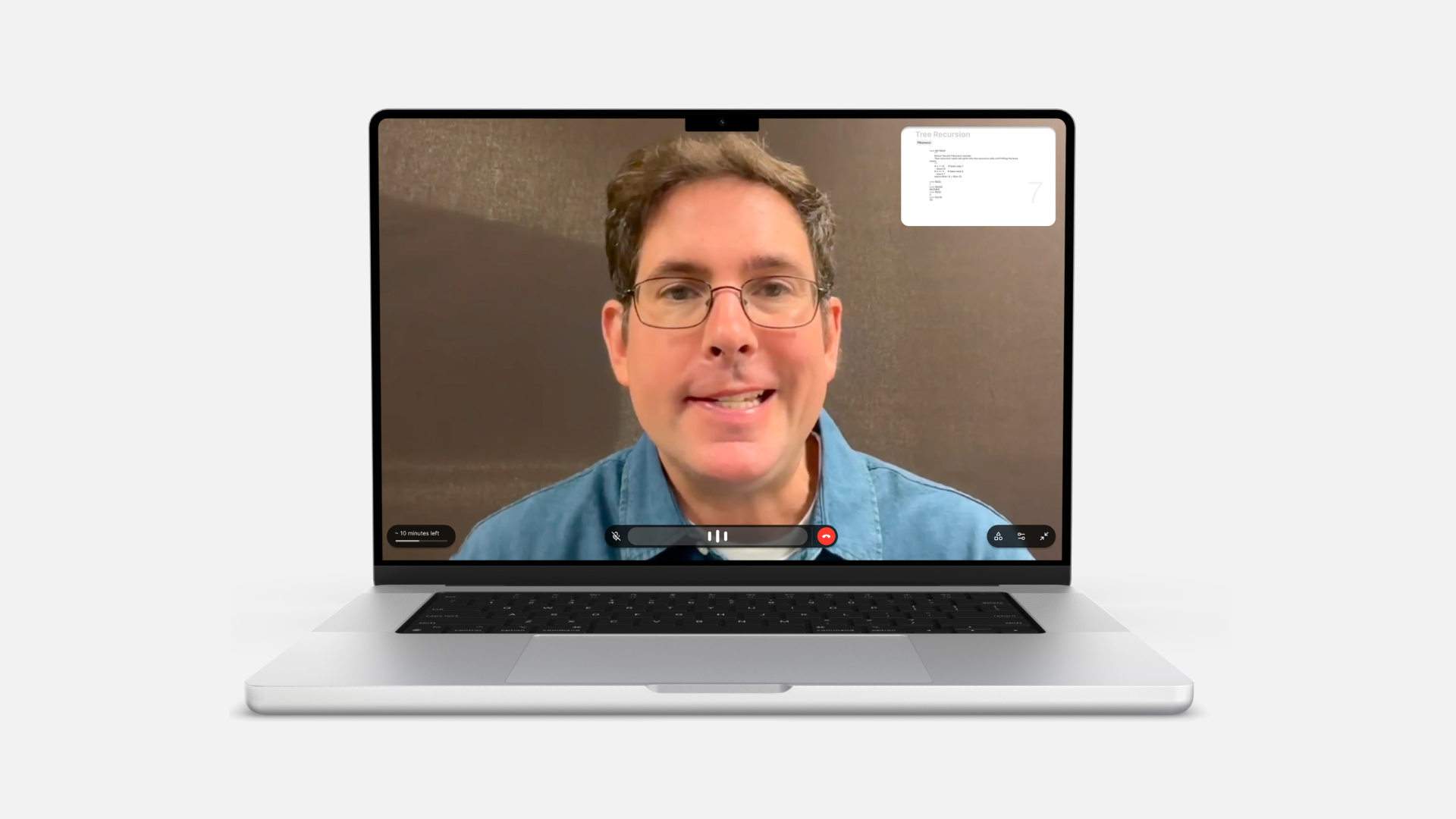
04
Join a Meeting, Not a Call
Sessions are designed to feel like joining a meeting, not starting a call. Seeing the on-screen avatar creates a sense of shared space and makes participation feel more present and intentional.
Video demonstrate how to start a Sklyow AI meeting and some interactions.
Iteration | 2

Previous Skylow Homepage
Designing for Early-Stage Growth
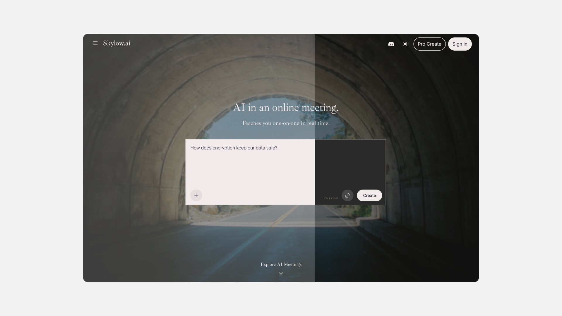
Early on, Skylow’s homepage focused on browsing existing content. That worked when there was a lot to explore, but in an early-stage product, limited content made the experience feel empty and harder to get started.
We also learned that people came to Skylow to create for very different reasons. Some wanted to quickly think through an idea by dropping in a question, link, or file. Others wanted to carefully create structured, reusable sessions. Treating creation as a single, fixed flow didn’t support these different needs.
To grow the ecosystem, creation needed to be easier, faster, and more flexible, especially for first-time users.
01
Two Creation Paths
We introduced two clear ways to create. A quick-create path lets anyone start a session in one step by entering text or uploading a link, file, or video. A more advanced path gives creators extra control to build structured sessions and personalized avatars.
02
Creation-First Homepage
The homepage was redesigned to put creation front and center. By focusing on a single input and removing distractions, the experience encourages users to start by expressing an idea, lowering friction for first-time use.
03
Shuffle Create Ideas
To reduce the “blank page” problem, we added a shuffle feature that shows example prompts in the creation area. This helps users understand what’s possible and makes it easier to start without overthinking.
04
Auto-Scroll to Content
As users scroll, existing content is gradually revealed. This keeps creation as the main entry point, while still allowing people to discover sessions naturally without competing with the act of starting something new.
Video demonstrates current Skylow homepage flow for new users

Current Skylow homepage featured section

Current Skylow playlist detail page
Visual Philosophy
Human at the Core
Skylow is about making AI learning feel human. Therefore, Skylow's visual design brings together a natural, human feel and a clean academic aesthetic. Through minimal design and selective usage of sharp edges and thin strokes, the interface feels neat and quietly elegant. Skylow also supports both light and dark mode, so the experience feels comfortable across different environments and longer study sessions.
Skylow homepage light and dark mode
Learning with AI shouldn’t feel like entering a tool. It should feel like entering a space.
Inspired by the line “行到水穷处,坐看云起时”, this sign-in page is designed as a quiet moment before learning begins. The interface is clear and unhurried, while the landscape opens outward, creating space to pause and breathe. It frames learning not as something to rush into, but as a journey you enter calmly, at your own pace.

Skylow sign-in page light and dark mode

Nature-Inspired Neutrals
Skylow’s palette comes from granite and fog: soft paper backgrounds, cool greys for depth, and graphite for crisp focus.


.gif)


.gif)